DELIVERABLES


Creative Strategy

Illustration

Packaging

Advertising

Photography

Film


Recognition


After the release of many successful special edition products inspired by the new brand positioning, Highland Park asked us to reimagine the brands core range.


WE TOOK A REVOLUTIONARY AND RADICAL DESIGN APPROACH. EVERYTHING FROM COLOURS, NAMING, DECANTER SHAPE TO ILLUSTRATION, MATERIALS AND PACK FINISHES WAS REINVENTED TO REFLECT THE VIKING BRAND POSITIONING. FOLLOWING ON FROM OUR WORK ON THE REBRAND, OUR RESPONSE WAS HEAVILY INSPIRED BY VIKING ARTISTRY AND CRAFTSMANSHIP.


OUR INSPIRATION FOR THE DESIGN CAME FROM AN ANCIENT “STAVKIRKE” (WOODEN CHURCH), A WORLD HERITAGE SITE IN THE TINY NORWEGIAN VILLAGE OF ORNES.


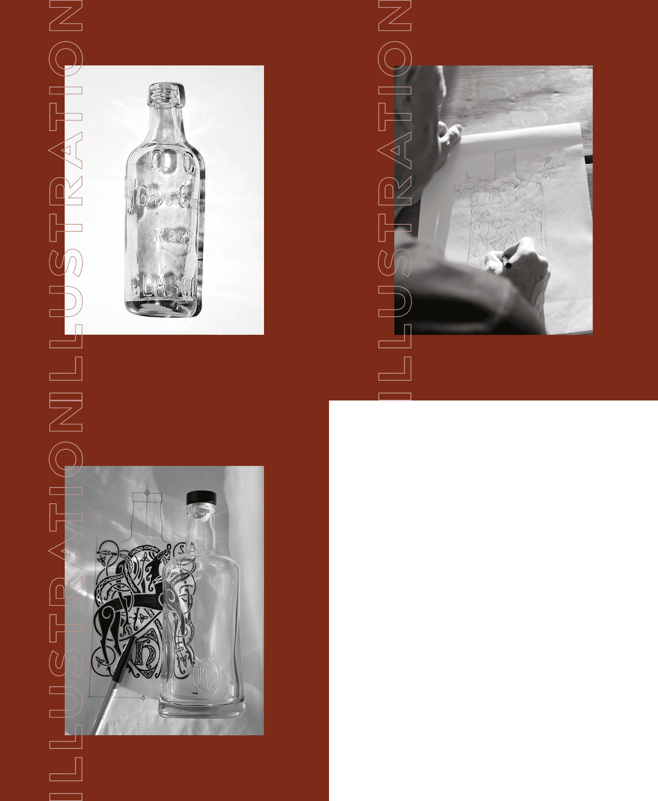
WE BROUGHT VIKING MYTHOLOGY TO LIFE THROUGH HANDCRAFTED ILLUSTRATIONS. USING PROGRESSIVE PRODUCTION TECHNIQUES WE CREATED A NEAR THREE-SIXTY DEGREE EMBOSSED GLASS BOTTLE SHOWCASING OUR BESPOKE ARTWORK.


We rendered the handcrafted drawings digitally giving them a clean and contemporary look. Using progressive production techniques we created a near three-sixty degree embossed bottle showcasing our bespoke artwork.


Underlining Highland Park as the Orkney Single Malt with Viking Soul, we gave each variant its own ‘sub-brand’ name


As part of the relaunch campaign we captured a suite of product photography for the entire range.


Creating a short film as part of the product launch, we showcased the bottle, pack and the newly re-imaged brand identity.


Increased sales volume and value by 35%