Highland Park wanted to strengthen their new viking positioning through a string of special releases. We were tasked with bringing this brand idea to life and evolving it in new and engaging ways. The focus was on tying the viking idea, distillery location and liquid credentials together in a compelling way.
Orkney has a rare climate with intense and contrasting seasons. From the endlessly bright summer solstice to the pitch dark long winter months, these extremities play a crucial role in characterising the whisky. Our idea was to bring this to life, celebrating how extreme OPPOSITES can EXIST IN PERFECT HARMONY to make a whisky that is uniquely Highland Park.
Two special edition bottles come together to form ‘The Runes’ Series. Paying tribute to Orkneys intense seasons, ‘THE DARK’ represents autumn and winter while ‘THE LIGHT’ reflects spring & summer.
The runic writing on our packaging celebrates the Vikings, who left behind many documents in stone, wood and metal, all written in the enigmatic symbols known as runes across many different locations on Orkney.
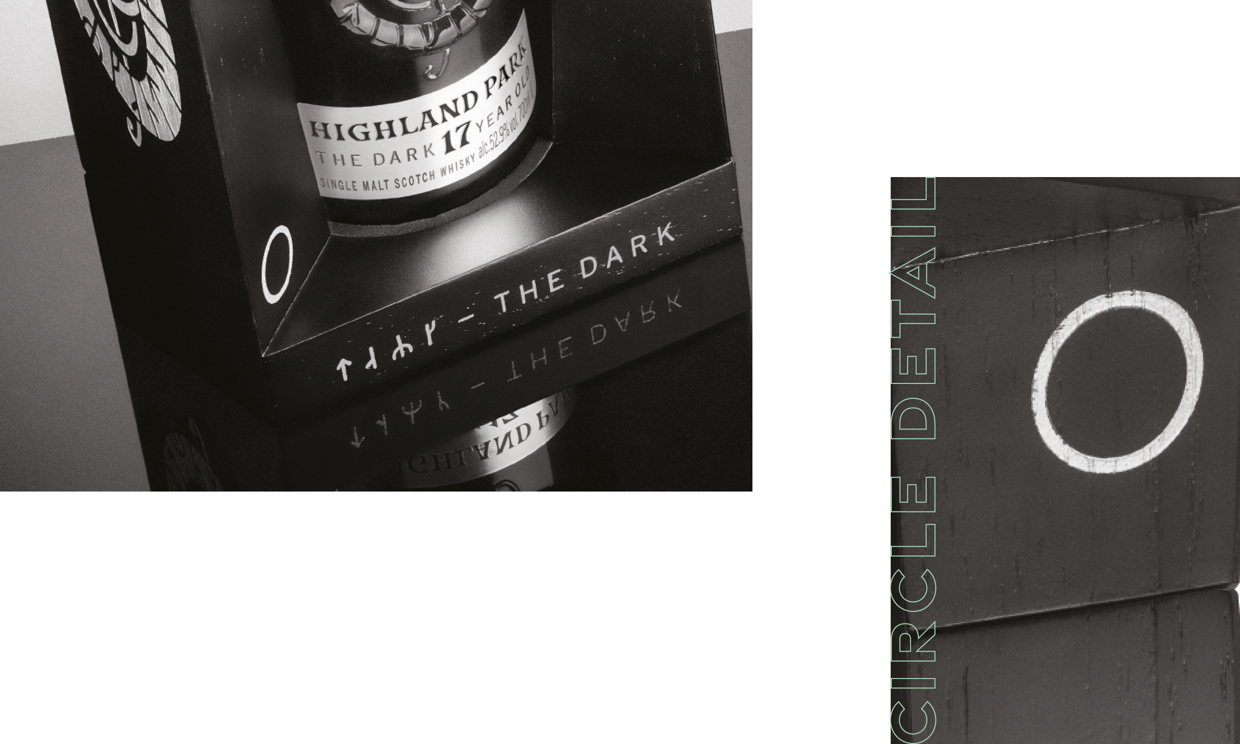
Heavily embossed on the glass and carved into the wooden cradle, a viking serpent dragon is the focal point on each of the packs. We crafted this artwork by hand initially before developing it digitally. We introduced circle iconography to represent the sun. Mirroring the suns position in the sky, we placed the icon on the top and bottom of the oak cradles.
To bring the story and history to life, we created a bespoke book that came with each release.
We created studio photography and atmospheric builds as part of the campaign.