DELIVERABLES
Strategy
BRANDING
Copywriting
ILLUSTRATION
Guidelines
POS & MERCH
Recognition


Over the past two decades we have been responsible for creating and developing Highland Parks brand identity. Initially the brand were looking for a compelling logo that reflected the new ‘Viking’ positioning.
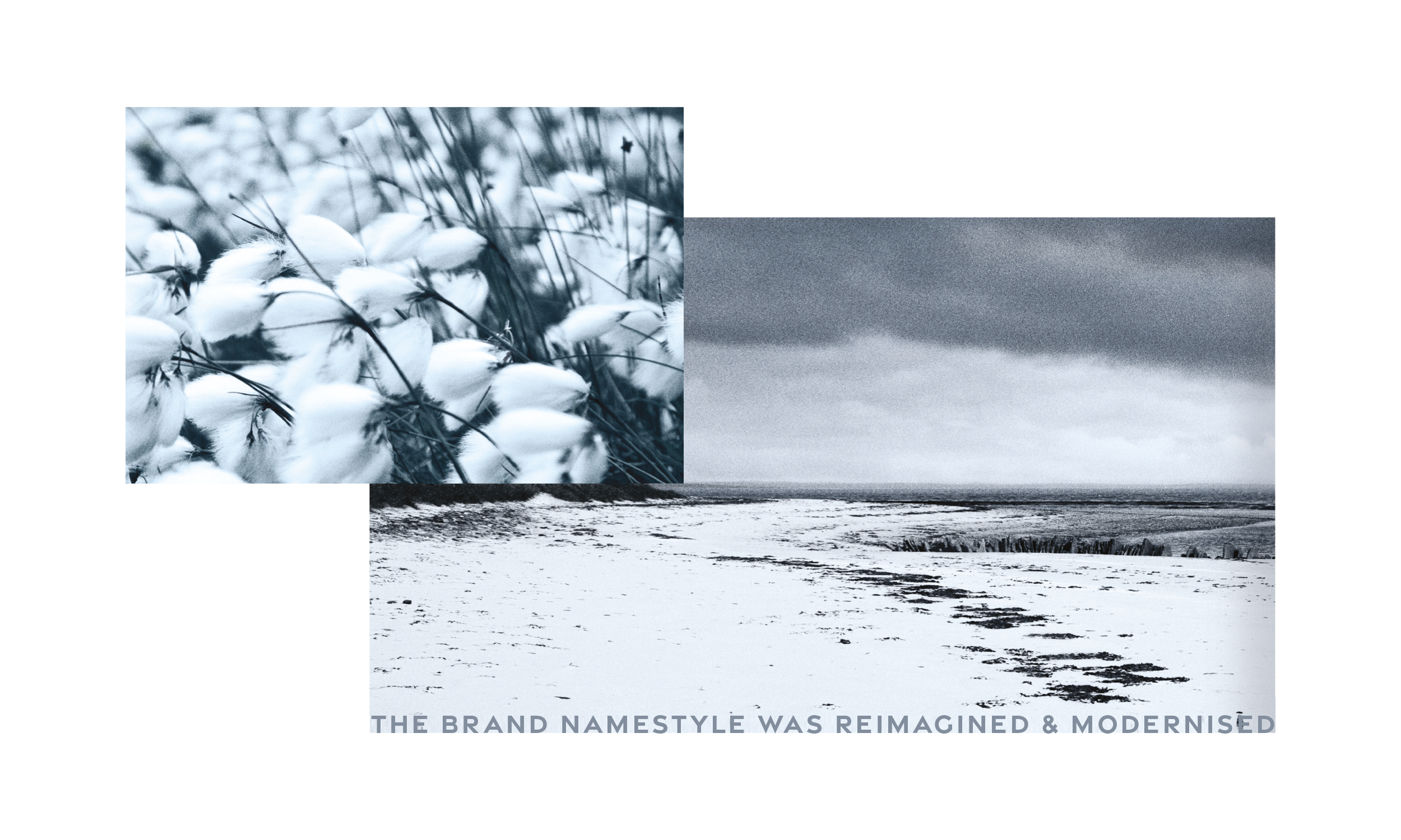
After a successful rebrand, we were later tasked with updating all brand assets including logo, name style & secondary graphics. The key focus was to modernise the brand and stand out against competitors.

Our approach was to lean further into the Viking comms idea as we knew this would increase brand visibility and help differentiate Highland Park in a busy market place. We created a bespoke and distinct aesthetic for the brand inspired by Viking arts & craft.


The existing logo was the letter h in a box typographically rendered in an English font. It didn’t give the consumer any insight into where the distillery was geographically or its rich history.

It was important that existing consumers recognised the brand so we embraced an evolutionary design approach. We kept the key logo identifier of the single typographic letter and created a silver Amulet featuring a viking “h”at its centre.
The vikings were great craftsmen and silversmiths. Inspired by this, we rendered the icon in a metallic silver which also set the brand apart from its competitors as most malts were using gold. For the final image creation, we had it handmade in Orkney by a Kirkwall silversmith.

Reinforcing the brands positioning, we created a bespoke typeface inspired by Historical artefacts and Viking typography.


Our new strap line reinforced Highland Park as the brand with viking heritage. Embracing a confident tone of voice, we spoke to the ‘adventure seeking’ target market in a stirring and emotive way.

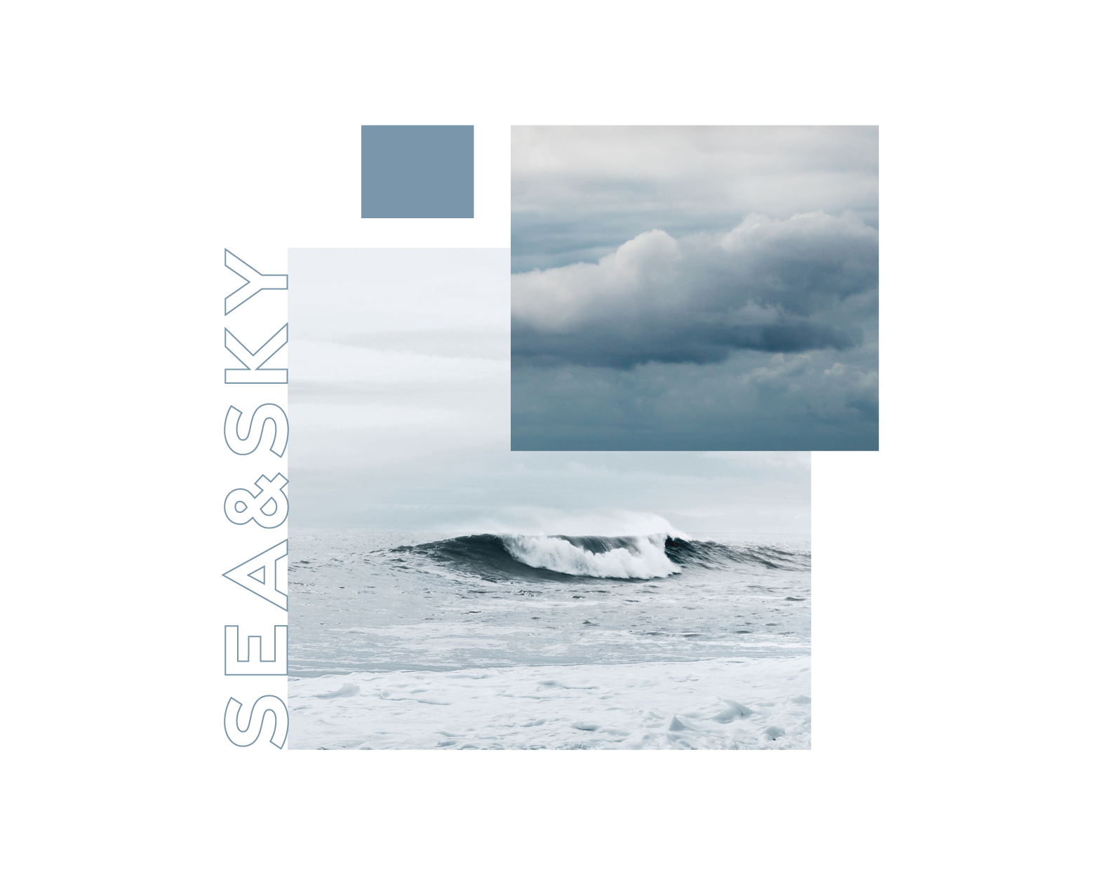
Taking inspiration from Highland Park’s home, we carefully selected colours that reflected the Orcadian natural landscape and environment. We plucked colours from the moorlands, rocky sea cliffs, the sky and flora surrounding the distillery. This was a massive change from the very muted palette thaT had been used for years.